Frankenthaler Woodcut Color
Frederick Project: Colors and Collaboration
Friday, March 27, 2020
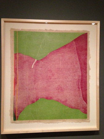
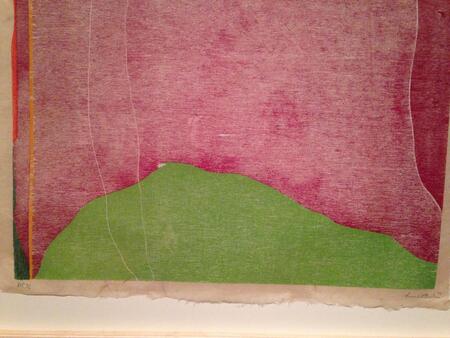
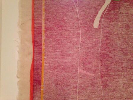
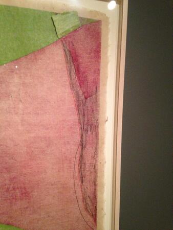
Helen Frankenthaler, Savage Breeze, 1974, Color woodcut from eight lauan mahogany plywood blocks on buff laminated Nepalese handmade paper; artist's proof, edition of 31. Printed by Bill Goldston and Juda Rosenberg. The Art Institute of Chicago, U.L.A.E. Collection. Photos Rachel Cohen.
Helen Frankenthaler (1928-2011) worked with many kinds of material. Two springs ago, the Art Institute of Chicago held a show of her prints: Helen Frankenthaler Prints: The Romance of a New Medium. I went a couple of times, and once took our daughter, for whom colors are living presences.
Frankenthaler started working seriously as a high school student, with artist Rufino Tamayo as her teacher. Tamayo, born in Oaxaca, painted in an abstract style, and was influenced by surrealism. Octavio Paz said that to say in one word what distinguished Tamayo’s work from that of his contemporaries was to say “sun.” Tamayo once told an art critic that using fewer colors increased the possibilities of those colors you used.
Frankenthaler began printing in 1961. She worked at a print workshop on Long Island called Universal Limited Art Editions (ULAE) that had been founded by Tatyana Grosman. Artists whom Frankenthaler was friendly with, Grace Hartigan and Larry Rivers, persuaded her to try the medium out. Together with the various master printers who were her collaborators, she printed seriously for the next seventeen years.
This one we’ve been looking at is called Savage Breeze. It was hard to get, she said, the hardest print she ever worked on.
Savage Breeze was printed by Bill Goldston and Juda Rosenberg. Pulling prints is extremely technically demanding and printers play a central role. In Japanese woodblock prints, the printer was always acknowledged as a fellow creator, as were those who carved the wood blocks. Mary Cassatt and Edgar Degas both worked with master printers. When I saw the Frankenthaler show, I was delighted by the little handwritten notes from her to the printers on certain draft prints, explaining the effects she was hoping for.
Color is not a given. A long process of trial and error. Savage Breeze began as Vineyard Storm.
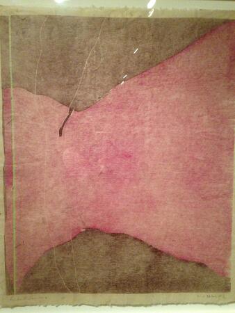
And even once she’d moved from brown to green, the colors still didn’t look right. The wall text had a nice quotation from her:
Savage Breeze went dead like a lead balloon. So after many tries, I finally said, let’s scratch it. I was almost exasperated. I couldn’t get the light I desired. I knew the drawing was right. I knew the scale was right. Then I thought—why don’t we whitewash the paper first and then print the other colors I’d mixed over it. We did. And it glowed.
But the composition, the areas of color, still didn’t work. They tried a darker burgundy block over the green, but Frankenthaler didn’t like the result. In some places, she told them to cut back the burgundy block, and made crayon marks to show where. The cut away areas showed white in the final prints. In another spot, she attached a little green square of paper to show how she wanted it to look – color as edit.
Here in Chicago, the day began with a thick fog and still there seems a layer of gray cotton over the trees and houses. We are waiting, so intently, for spring. Wash, pare, wait, pull the sheets again.
For Tara, sheltering on the Vineyard